Light Mode
Last summer I redesigned this site around a light-mode theme. It was a creamy-coffee colour with dark brown text, a marked departure from the dark mode, light-text on dark-background, low-contrast design I had before. Immediately I had folks reach out complaining.
I understood where they were coming from. I’d preferred dark mode for a long time too. From the day I started writing code, I’d become a dark mode user with everything I did, including every terminal I’d ever opened. As mobile OSs enabled dark modes, I switched to them, and as the web slowly adopted darker themes I happily switched to them when I could.
But last summer I found myself enjoying light mode websites more than dark mode ones. I couldn’t really explain why, but that piece of me that appreciates design had inexplicably developed a preference for lighter apps.
Then around Christmas time, I learned why, and the answer is my astigmatism.
Astigmatism and Halation
I went to the opticians around Christmas as I did every two years — now reduced to every six months since turning forty, something nobody tells you about in advance — and while everything was largely normal I found myself complaining once again about how my prescription wasn’t perfect with my daily contact lenses so text on a computer wasn’t always perfectly easy to read. That led me to trying out rigid gas-permeable (RGP) contact lenses, the small hard type that sits directly on your cornea.
RGP contact lenses are sort of awful. You lose much of your peripheral vision with them, and they’re super uncomfortable. While you can forget your soft daily contact lenses are even in after a few minutes of getting used to them, you’re always aware when RGP lenses are in. They feel like having something in your eye, permanently, itching and scratching.
They are, however, entirely worth the discomfort because vision with them is perfect. I’m not exaggerating. RGP lenses act like a pair of glasses that sit perfectly on your cornea. There’s no distortion, and they don’t slip around on astigmatic eyes like soft daily lenses do. They’re unbelievable, and I moved wholly to using them at once as soon as I saw their effect.
While chatting enthusiastically about them with my optometrist, including my frustration about using my previous lenses when using a computer, they mentioned trying light mode. “There’s a phenomenon called halation,” they explained, “That makes it harder to read in dark mode if you have astigmatism.”
I was blown away. I’d had astigmatism since I was a kid, the mild condition that has the lens or cornea of the eye being slightly misshapen, causing blurry vision. It changes over time, necessitating new prescriptions on a regular basis, and constantly causing frustration with contact lenses. With soft daily contact lenses, the kind that accommodate astigmatism are essentially teardrop-shaped, which gives them a weight and a specific rotation they sit at on your cornea to account for the astigmatic shape of the cornea or lens. They slip and rotate easily, however, constantly adding some blur into your vision through the day. RGP lenses correct that entirely.
With dark mode, my optometrist told me, astigmatism causes a subtle halation effect around lettering, a sort of sheen around thin lines that doesn’t appear in light mode.
I was sceptical, but sure enough, after testing at home on my computer, the difference was clearly night and day. Dark text on a light background was always clear and well-defined. Light text on a dark background always appeared thinner, less-defined, and often had a halation effect that made it appear harder to read. I had to make text much heavier weight or bigger in font size to overcome the effect.
I was astonished.
How It Looks
It’s strange dealing with something like this. I couldn’t figure out a way to depict the difference meaningfully. I still can’t — no screenshot or photograph is ever going to be able to depict it.
This is the best I can manage:

This is a crude diagram of the word ‘let’ crudely written by me on my awesome new Xencelabs graphics tablet. Handwriting aside, the lettering is clearly defined and legible.
Now, you might expect the following when the colours are inverted:

That makes sense, right? Much the same appearance, the same level of clear delineation between the lettering and the background, right?
Unfortunately, that’s not how lettering looks to me. The white lines look much smaller than they should, more like this:

Text looks thinner than it should, sometimes having or almost having gaps in places. This isn’t a perfect depiction either — sometimes the halation effect has a sort of ‘sheen’ around the edges of the lettering, making it look a bit blurry.
My new RGP contact lenses help with it, but they don’t eliminate the effect. What does eliminate the effect is using light mode. Text is clearly legible to the point where I can feel my eyes and forehead being more relaxed at all times.
Of course, blasting light mode light into your eyes isn’t always pleasant, certainly not at night, which is where colour temperature tools come into play. I use one called gammastep which works with Wayland. I start at 5,000K in the early evening, reducing to 4,000K as the night gets dark, and 3,000K as I approach the time I want to go to sleep. This is laborious, and startling when you first turn it on, but you get used to it very quickly and soon forget it’s on. I’ve sat here at times feeling the need to check it’s even on, because I become convinced that the light I’m looking at is pure white and I can’t imagine what it’d look like without being set to 3,000K. It’s always a mistake — turning gammastep off to check then immediately blasts incandescent white light into my eyes.
Laborious as it is, it’s also a reminder that that blue light was always there even when I was using dark mode. It was just more comfortable, less noticeable in dark mode. As someone who suffers from sleep issues and migraines (both of which have reduced since I switched to light mode), it’s a good reminder that I should’ve been managing the colour temperature of my displays all along.
My Light Mode Usage
Armed with my new RGP lenses and being more rigorous about managing colour temperature, I’ve redesigned my website again, this time around the excellent Gruvbox colour scheme’s light mode palette. It’s also rewritten as a Rust app using axum and leptos, which I’ve been struggling to learn since Christmas in amongst my other work.
I use the same scheme elsewhere. My desktop looks like this:
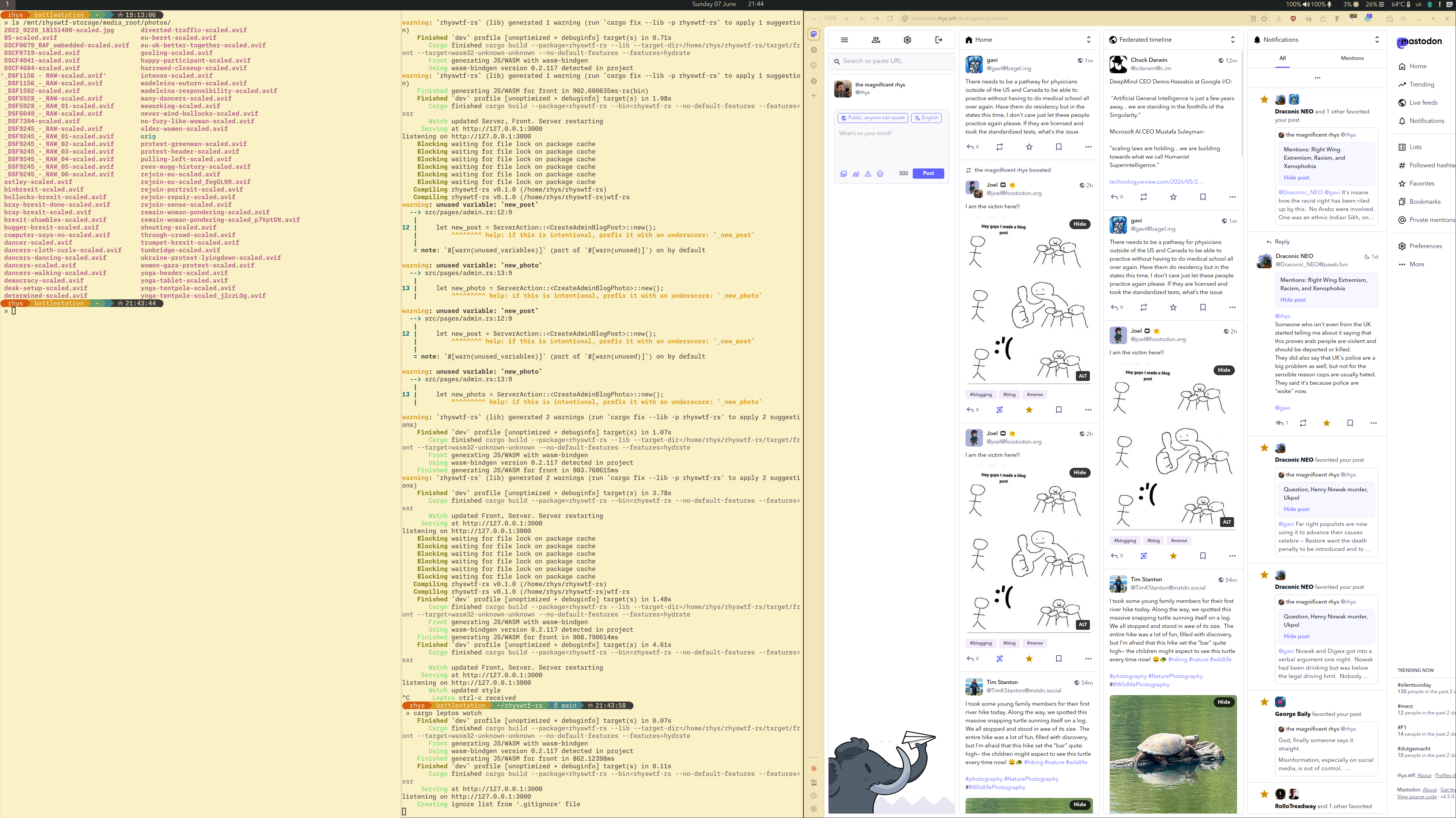
That’s Sway with my Waybar in dark mode and my apps themed around Gruvbox. Alacritty’s configured with light mode colours, as is neovim and my custom zshrc theme, with my pathbar using Gruvbox colours. Firefox uses a Gruvbox Light theme (there are many available), and this screenshot demonstrates the only major problem I have with this set-up: web apps that I either can’t configure or don’t have good themes available.
I have some ideas for building a Firefox extension to meet my needs, but for now I use Firefox’s High Contrast Mode late at night. High Contrast Mode is intended as an accessibility feature, but has some few configuration options that I find useful.
Here’s how Mastodon looks with my config enabled:

This isn’t perfect and there’s much I don’t like about it, but I find it insanely useful when browsing at night, and I admit to taking some design inspiration from Mastodon’s appearance in this mode for my site redesign.
I don’t know what others will think looking at it but I find it so much nicer to read and use than the white theme, especially when I combine it with my own fonts (enabled by a Firefox extension).
Final Thoughts
I’m honestly kicking myself for so many years spent struggling with my vision. Really, it was a struggle with dark mode, one I never should have stuck to.
I recently told this story to a grey-beard tech nerd I know who laughed at me. He said that he remembered when light mode first appeared on computer systems in the late 1980s, and that he and others from that period recognised its benefit immediately. He’d switched to it immediately and had always scoffed at people who didn’t, viewing dark mode as a sort of Matrix-esque hacker-wave style thing.
For my part, I have no regrets with switching back to light mode. Combined with the perfect vision my RGP lenses give me, I find myself much less tense and much less frustrated when using my computers every day. I still use dark mode on my phone — nobody needs to be blasted with white light while showing tickets for a gig in a dingy venue — but I doubt I’ll ever go back to dark mode on the desktop ever again.